What dictates the colour of the year, who decides, and what are they looking for?
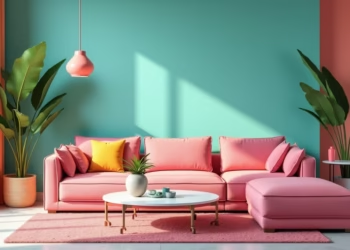
My Pantone colour guides are a wonderful world of colour; strangely, I rarely refer to them. At the moment, I love the muted and often matte pastel hues used for objects like bathroom vanity basins and on walls. Contrasted with arches and drawing inspiration from historical styles with an up-to-date palette…Pastels and arches..
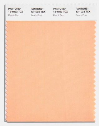
I quite look forward to the Pantone Colour of the year revealing even more than the MAFS finale. It is interesting to see how the colour is promoted and the explanations behind their decision. Sometimes I love the colour and other times I just can’t get excited by it. All the same, it is of great interest. The Pantone Colour Institute originally created the Pantone Colour of the Year programme in 1999 to engage the design community and colour enthusiasts around the world in a conversation around colour. They wanted to draw attention to the relationship between culture and colour. So, the Pantone colour of the year for 2024 is, as you may already know, Peach Fuzz, Pantone 13-1023. It is a velvety, gentle pastel peach colour – very 1990s that aims to bring comfort and warmth. The Pantone Colour Institute says this year’s choice “echos our innate yearning for closeness and connection”. It makes sense after the past years of lockdowns and losses that the world suffered during the COVID-19 pandemic and other disasters.
The colour of the year crosses all areas of design; it is a reflection of lifestyle trends, and it is an indication of what we will see in the upcoming year. You will notice it across every imaginable surface, texture, material, and finish. I do not see myself wearing Peach Fuzz, but I may find a way to incorporate it into my next project, our one-bed apartment in Melbourne. Peach Fuzz might just be the injection of fun the well-lit lounge/dining area needs, if only we had an arch…..
Basins in gorgeous colours
Nood.co
I have a serious crush on NOOD CO concrete basins — and honestly, I see one in my future. Maybe even two. They’re just that dreamy! I’m absolutely obsessed with their gorgeous pastel shades, not to mention the bold, vibrant colours if you’re feeling a little more adventurous.
What makes them even better? Every basin is sustainably handmade right here in Australia. NOOD CO has truly become the go-to name for bringing colour into bathrooms in the most beautiful, thoughtful way. Their basins are so organic and tactile, you’ll actually find yourself wanting to hang out in your bathroom a little longer (maybe a lot longer).
With 21 incredible colours to choose from, there’s truly something for every style — whether you’re after soft and subtle or bold and dramatic. Plus, they offer worldwide delivery, so no matter where you are, you can bring a little slice of bathroom heaven home.
Seriously, feast your eyes on these beauties — your bathroom will thank you!
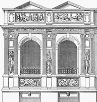
Underneath The Arches
The use of arches in conjunction with colour brings a solid, timeless element into a home. Creating Arches and contrasting them with the softened colour palette that is being seen right now is a striking combination. I wish I had an arch or two.
There’s just something timeless about a good arch, isn’t there? They’ve been part of home design for centuries, and when they’re done right, built into thick, solid walls, they give off that incredible old-world charm. You know, the kind that makes you think of ancient stone buildings where everything looks like it’s casually ignoring the laws of physics.
One of the golden eras for arches was during the Romanesque period, from about the 6th to the 11th centuries. Back then, across medieval Europe (and in places like our beautiful French village of Treignac), you’d spot these gorgeous rounded arches everywhere — in homes, churches, you name it. It was a whole vibe: thick walls, tiny windows, and that solid, grounded feeling that somehow makes you feel cozy and safe even today.
In the Gothic Period (12th to 16th centuries), Pointed
arches became more prevalent, contributing to the verticality and grace of structures. Living arches is how I would describe them, like sinew.
During the Renaissance (14th to 17th centuries), a revival of classical elements, including arches, was being used in residential buildings to add elegance and symmetry.
The Baroque Period (17th to 18th centuries), known for its ornate and dramatic features, utilised arches in residential architecture. Elaborate and embellished archways were common.
The Spanish Colonial and Mission Revival (17th to 19th centuries) saw Spanish-influenced architecture. Arches were widely used in homes during this Period.
In the 18th to 19th centuries, the Neoclassical movement, inspired by classical Greek and Roman architecture, incorporated arches into residential buildings. Creating stunning grand entrances or porticos.
During the Victorian Era (19th century), various architectural styles were used together, and arches were used in homes as part of marvelously eclectic designs. Gothic Revival and Romanesque Revival styles during this Period often featured arches.
Back in the late 19th and early 20th centuries, the Arts and Crafts Movement made its mark by celebrating simplicity, craftsmanship, and that beautiful, handmade touch. Arches — yes, those elegant curves we all secretly love — found their place in homes, but in a more natural, understated way. Think soft, organic shapes that quietly stole the show without shouting for attention.
Got an arch in your home? Show it off! I’d love to see it — snap a pic and share the magic!
Hi I'm Michelle, join me as I accidentally design my home and my life. I prefer being guided by instinct rather than formality and the expected. I draw on my eclectic life experiences to shape a philosophy rooted in creativity and joy. My passion is renovating properties to create vibrant, welcoming spaces that reflect both the past and the possibilities of the future. My AD blog is a journey of discovery through life and design, where intuition and curiosity lead the way.


