
For about thirty years, the rule in most Australian homes was simple. Walls got the colour. Skirting boards, architraves and ceilings got white. We did it without thinking, the way you butter toast without a recipe. Using a tri-tonal Colour-Wash Gradient changes this thinking.
That rule is being quietly dismantled — and the thing replacing it is the most flattering paint decision you can make in a weekend.
“Think of it as the ‘Horizon Effect.’ By stacking three tiers of a color gradient—anchoring the room with a rich, grounded base, transitioning to a soft mid-tone, and bleeding a whisper-light shade up into the ceiling—you create an enveloping, atmospheric experience. It mimics the natural transition of a twilight sky, making the room feel both deeply secure at eye level and endlessly lofty overhead.”
The Tri-Tonal Stacking effect: building a room from tonal shades of a single colour, so the eye glides rather than stops. No hard white lines. No visual speed bumps. Just one colour, gently graded across every surface.
It’s having a genuine moment, and unlike a lot of trends, it’s one that actually makes ordinary rooms look better. Here’s why it works, and how to do it without ending up in a fish tank.
Two names worth knowing
The trend has split into two approaches, and knowing which one you’re doing saves a lot of confusion at the paint counter.
Colour drenching is the bold one. You take a single shade and put it everywhere — walls, ceiling, skirting, architraves, sometimes the door and even the radiator. Designer Sophie Robinson describes the result as a space that completely wraps around you, where nothing gets left out. Because there are no stark white lines breaking the room up, drenching actually softens a space rather than shouting at it. Counterintuitive, but true: a deep terracotta feels far less aggressive when it’s the whole room than when it’s one wall fighting white trim.
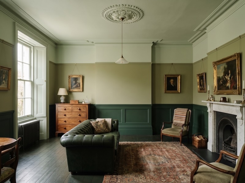
Colour-Wash Gradient, or Tri-Tonal Stacking, is drenching’s gentler cousin, and arguably the more useful technique for most homes. Instead of one flat shade, you use three or four tones from the same colour family and stack them by depth — and the arrangement worth trying is the grounded one: the darkest tone low, running across the bottom of the walls and right onto the skirting boards; a mid tone through the middle of the wall; and the lightest tone up high, carrying across the ceiling.
It works the way a landscape does. The ground is dark and solid, the sky is pale and open, and your eye reads it as natural before you’ve consciously noticed the colour shift at all. The effect is the opposite of a room that draws the eye upward — instead, it settles, anchors and steadies the space, as if the room is rooted to the floor rather than floating. It feels calm and substantial, which is exactly why it suits living rooms, bedrooms and dining rooms where you want to feel held rather than energised.
If drenching is a single confident sweep, this is the gradient — and it’s the easier, more forgiving place to start.
Why now
This isn’t paint companies inventing a reason to sell more paint, although they’re certainly enjoying it.
The broader 2026 palette has moved decisively toward grounded, layered, tonal rooms — walls, millwork and textiles sitting inside the same family of colour rather than high-contrast schemes. The mood is cocooning, not stark. Clay, terracotta, mossy greens, softened blues and warm neutrals are everywhere, and these earthy, complex shades happen to be exactly the colours that want to be graded across a room rather than boxed onto a single wall.
There’s also a plainer reason: paint is the cheapest way to transform a room, and people have stopped automatically defaulting to a white ceiling. Once you question that one habit, grading the whole room is a small leap — and a cost-effective one.
How to do it without regrets
The technique is forgiving, but a few decisions make or break the result.
Pick the colour like it’s a long-term relationship. This is the single biggest predictor of success. Muted and tonal shades age far better across a whole room than bright, intense ones — a colour that’s lovely as an accent can feel oppressive at full saturation. Live with large swatches on more than one wall, and look at them in morning light, afternoon light and lamplight before you commit. A north-facing room (south-facing, here in the Southern Hemisphere, gets the least direct sun — so check whichever of your rooms feels coolest and greyest) will read very differently from a sun-filled one.
Don’t fight a dark room with white. It’s the most common instinct and the wrong one. Pale paint doesn’t rescue a dim room; it tends to make it feel flat and lifeless. A dim space often looks far more intentionally embraced with a deeper, graded shade rather than fighting its nature with builder’s white.
Vary the finish, not just the tone. Even within one colour, changing the sheen does quite useful work — matte on the walls, eggshell on the woodwork. It catches light differently across surfaces and stops the room from reading like the inside of a single painted box.
Layer texture, because flat colour falls flat. This is the step people skip and then wonder why their drenched room feels like a cube. The colour is the backdrop; texture is what makes it sing. Velvet, linen, timber, woven baskets, a patterned rug that pulls in tonal variations of the same hue — these prevent a one-colour room from feeling one-dimensional. Robinson’s own rule is to introduce contrast within the palette, never against it.
Start small. A powder room, a hallway, a study, a guest bedroom. Small rooms are where grading is most forgiving and most rewarding — the enveloping effect that feels risky in a large living room feels like a jewel box in a loo. Get one right, and you’ll trust yourself with the bigger spaces.
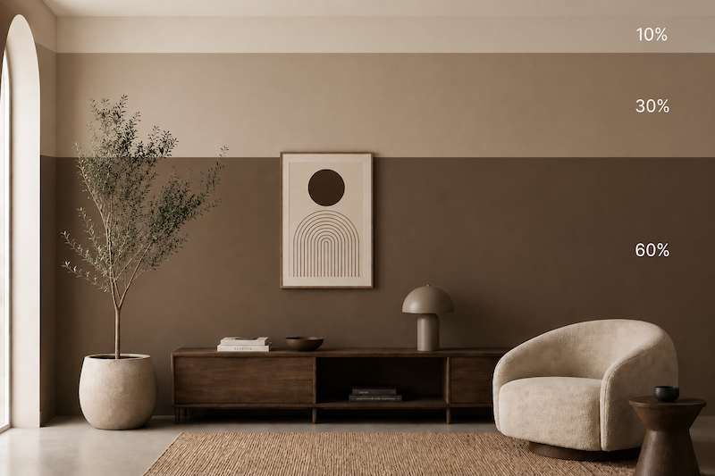
“Pro-Tip”- Visual Proportions: A strict 1/3 split for each colour can sometimes look too rigid (like a flag). For the most elegant look, use the 60-30-10 rule
60% (The bottom half to two-thirds) in the rich dark/mid tones.
30% in the lighter tone.
10% (or the remaining sliver) bleeding into the ceiling
The one mistake to avoid
Resist the urge to “rescue” the scheme with a contrasting accent colour. The entire effect depends on the eye not hitting a hard stop. A clashing cushion or a bright feature shelf undoes the cohesion that this technique exists to create. If you want variation, find it in tone and texture, not in a competing colour.
Where to begin this weekend
Pick the room you walk past most and like least — usually a hallway or a small bathroom. Choose one colour you genuinely love, not one you think you should like. Get tester pots in three depths: a deep one for the lower wall and skirting, a mid tone for the centre of the wall, and a soft one for the top of the wall and ceiling. Paint a vertical band of all three, floor to ceiling, on a wall that gets typical daily light, and carry the darkest onto a stretch of skirting so you can see the grounding effect properly. Leave it for two days.
Then view the room at different times of day. You’ll know. The moment the white lines stop interrupting your eye and the space starts to feel designed rather than assembled, you’ll understand why nobody’s painting their skirting boards white anymore.
It’s the rare trend that costs a weekend and a few litres of paint, and makes a room look like it cost considerably more.


